Branding
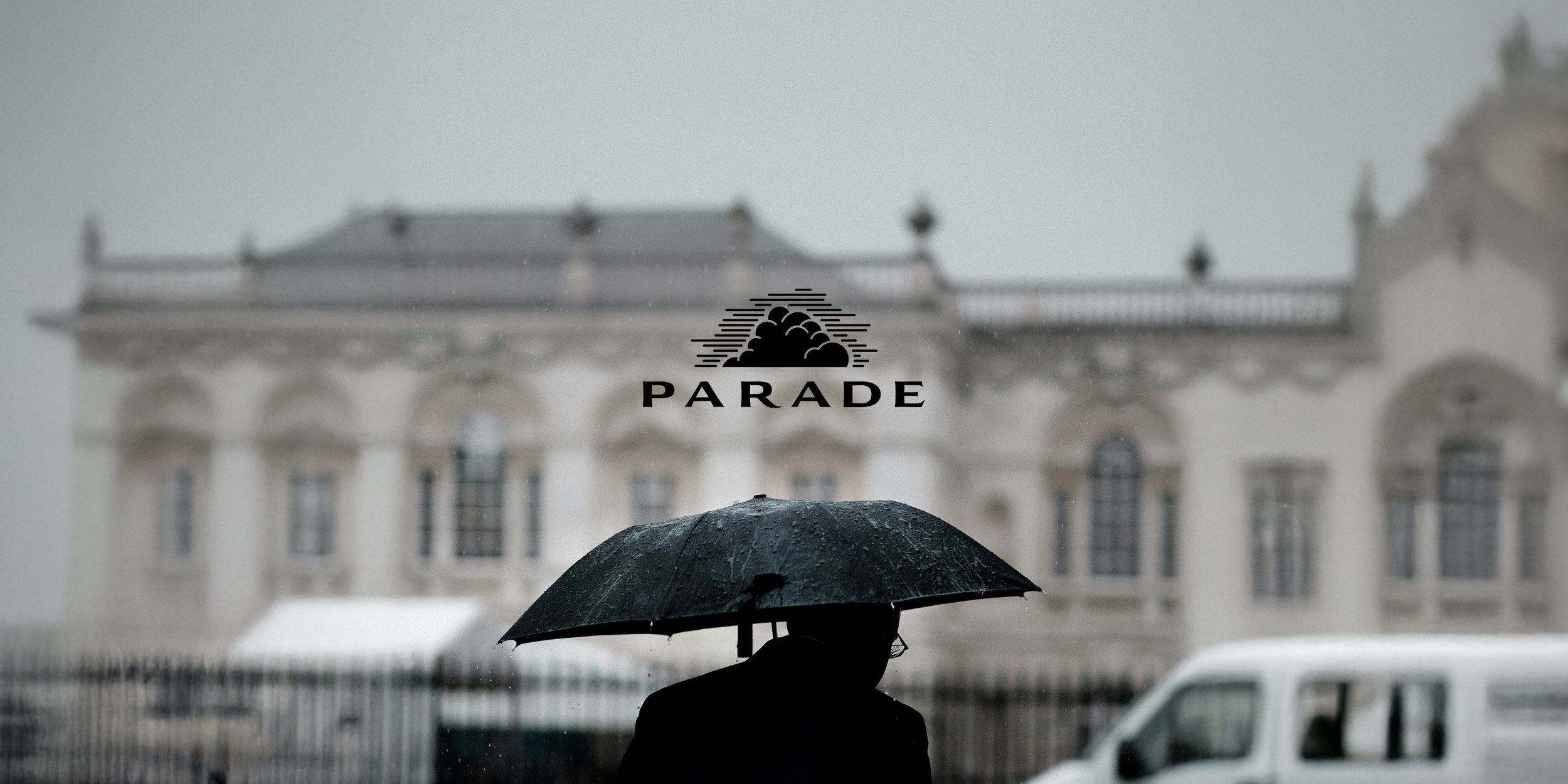
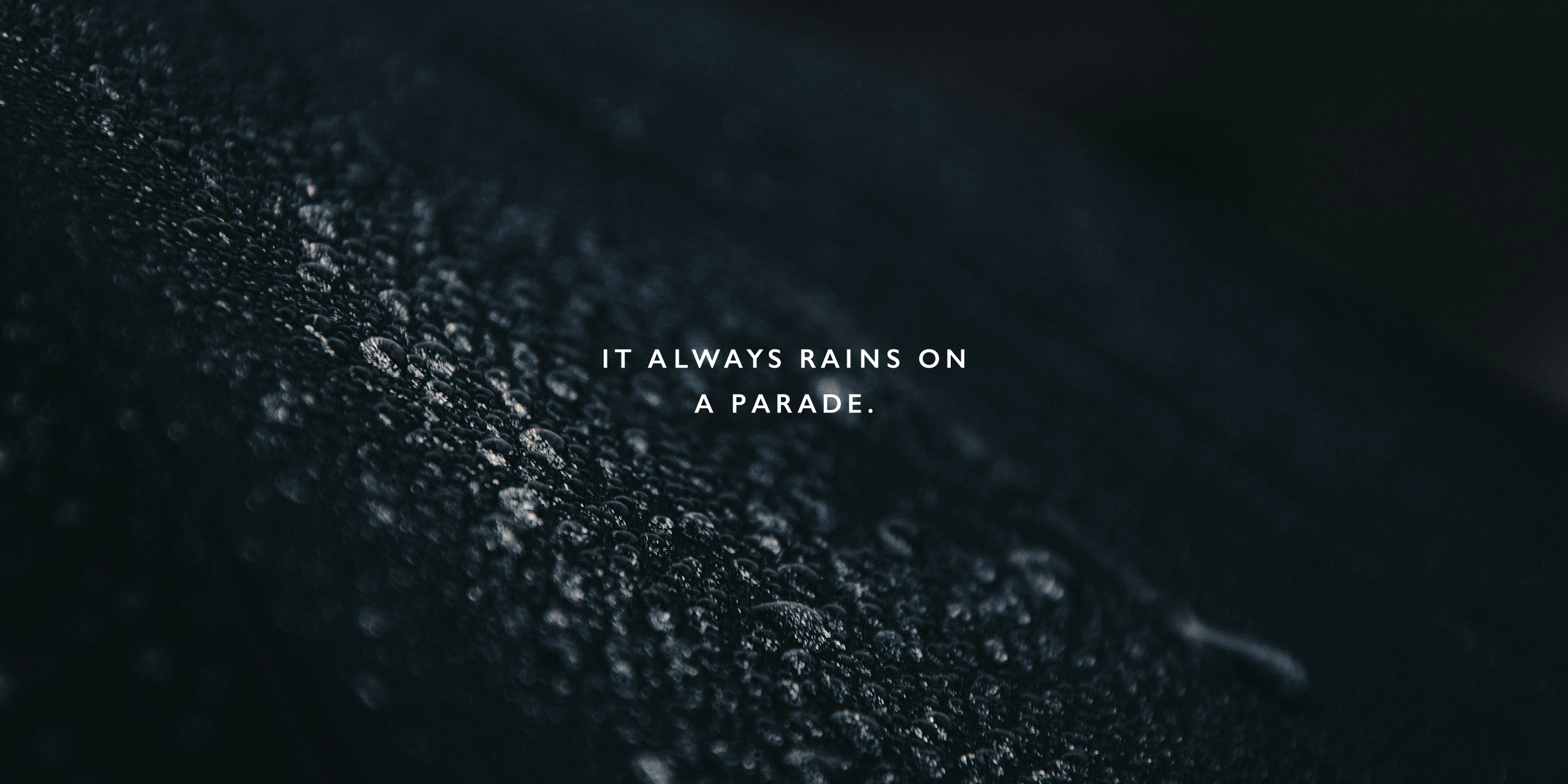
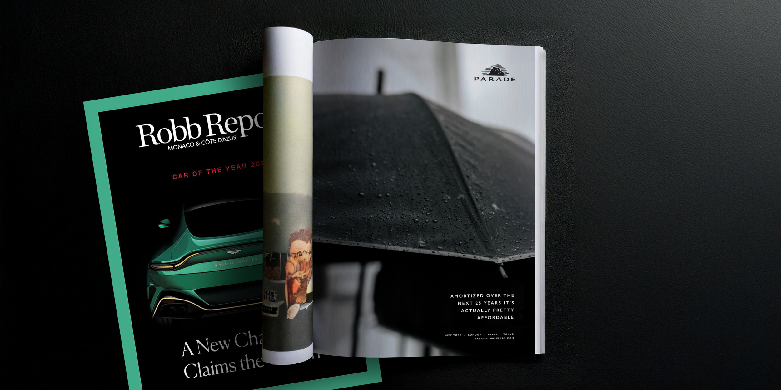
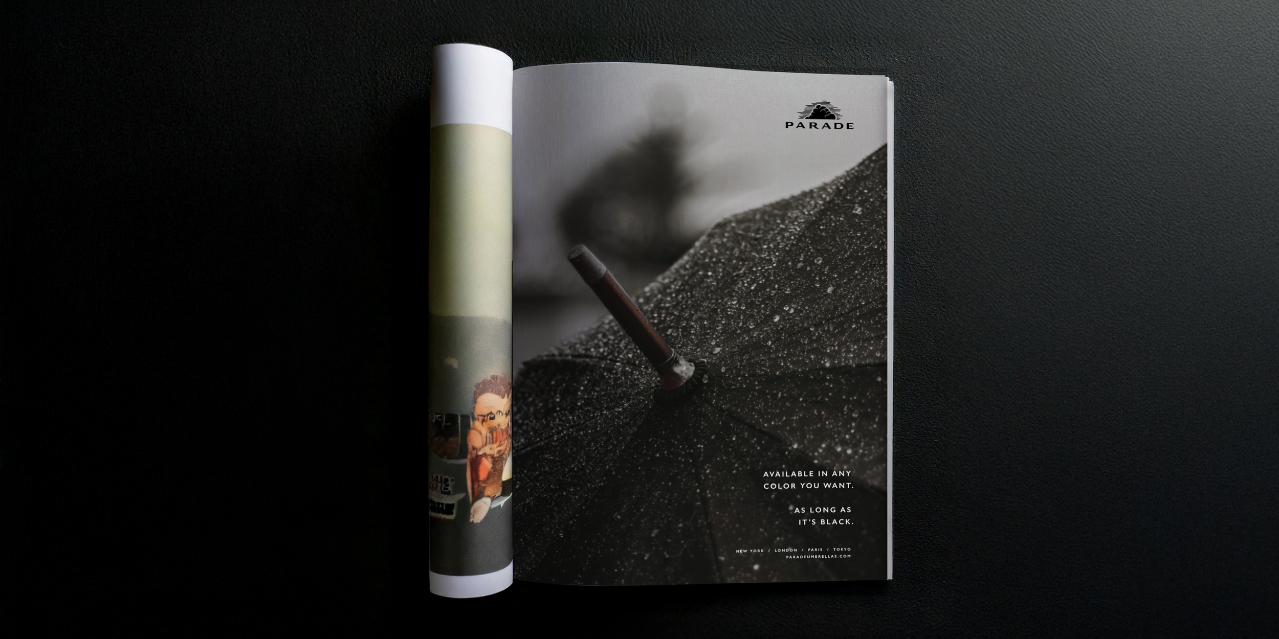
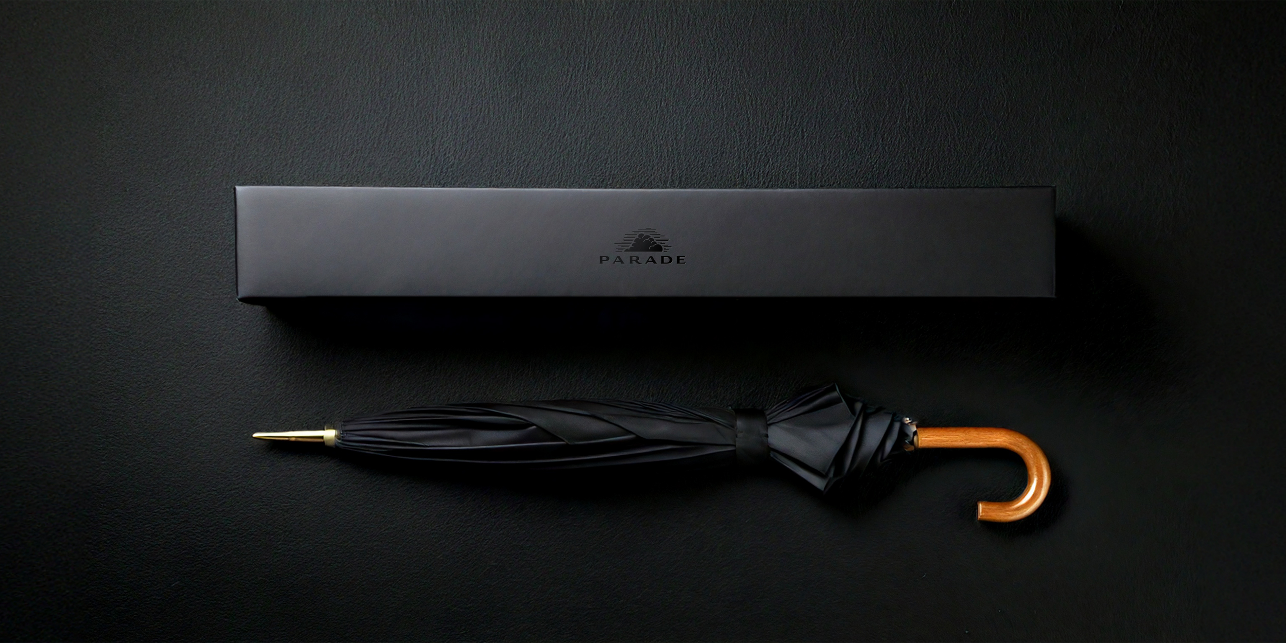
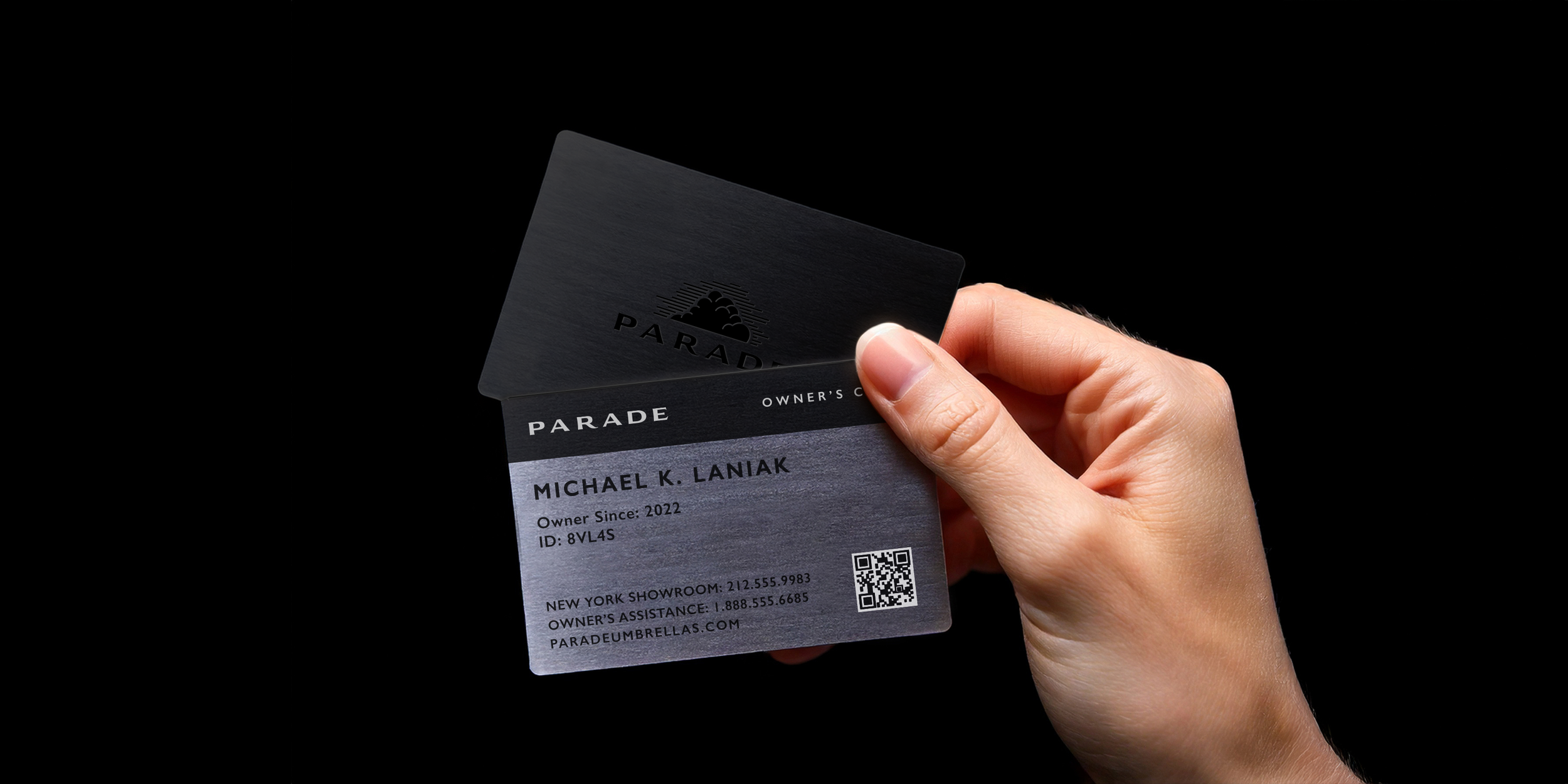
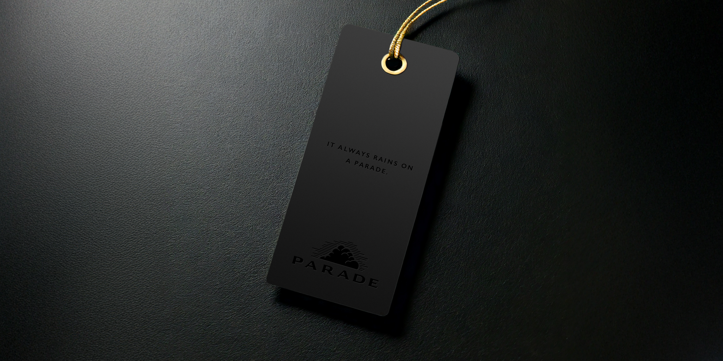
Parade
How do you sell an $800 luxury umbrella? You don’t talk about features, quality and value. Those are the table stakes for a luxury brand. You speak the same language as the target market. You talk about legacy, investment, and Henry Ford quotes. If you don’t get it, you’re not the target market. It also helps if ownership comes with a direct line to your local showroom and an international concierge service.


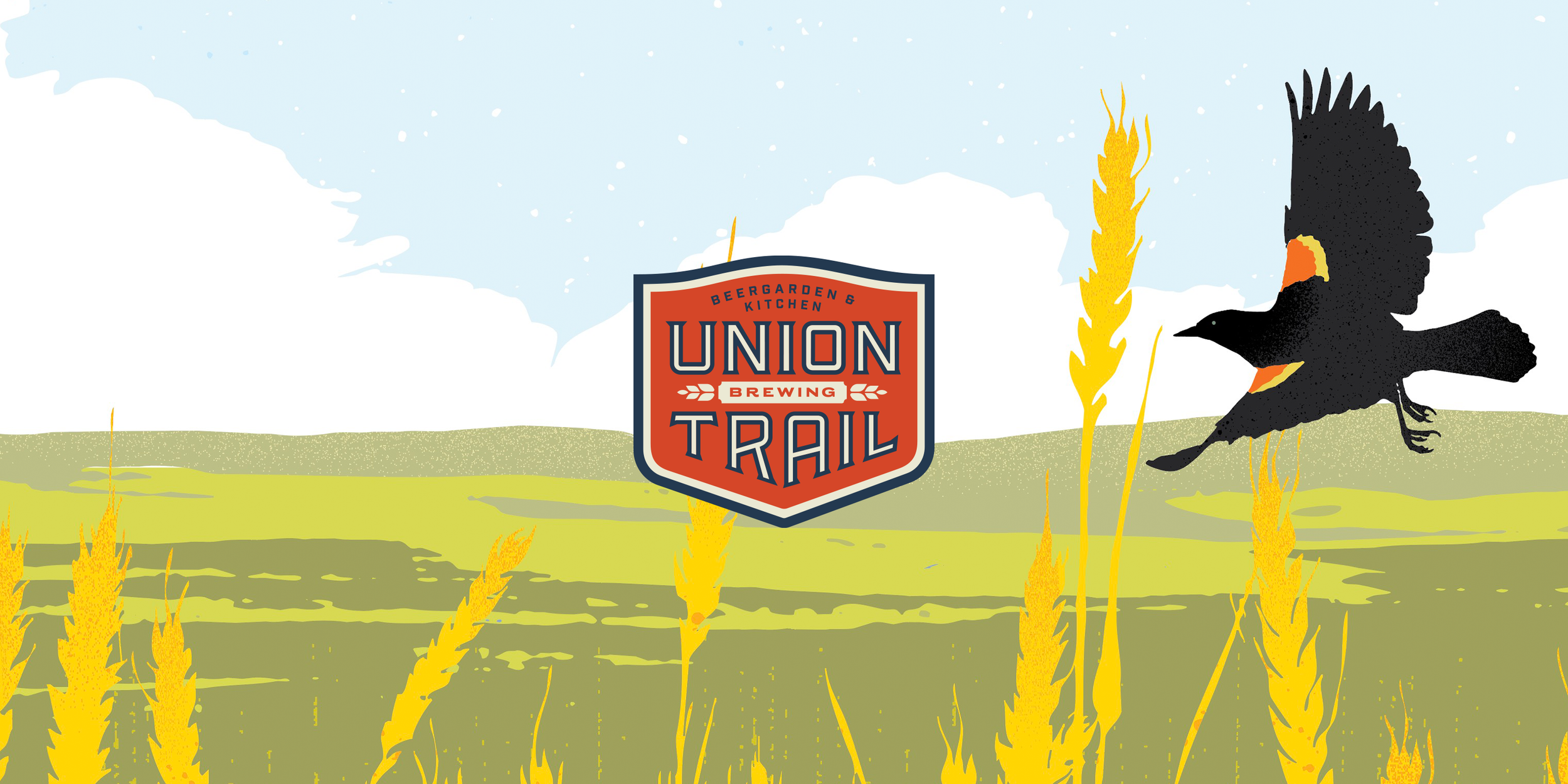
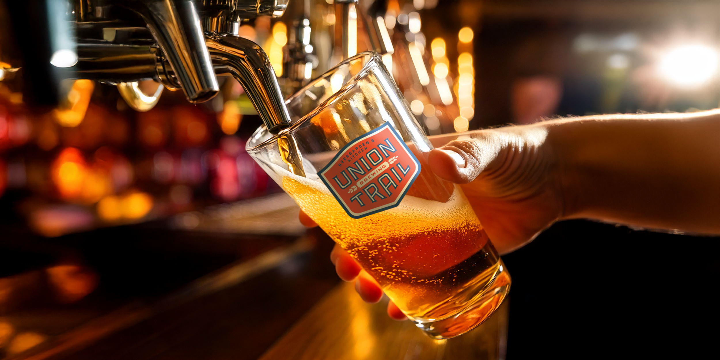
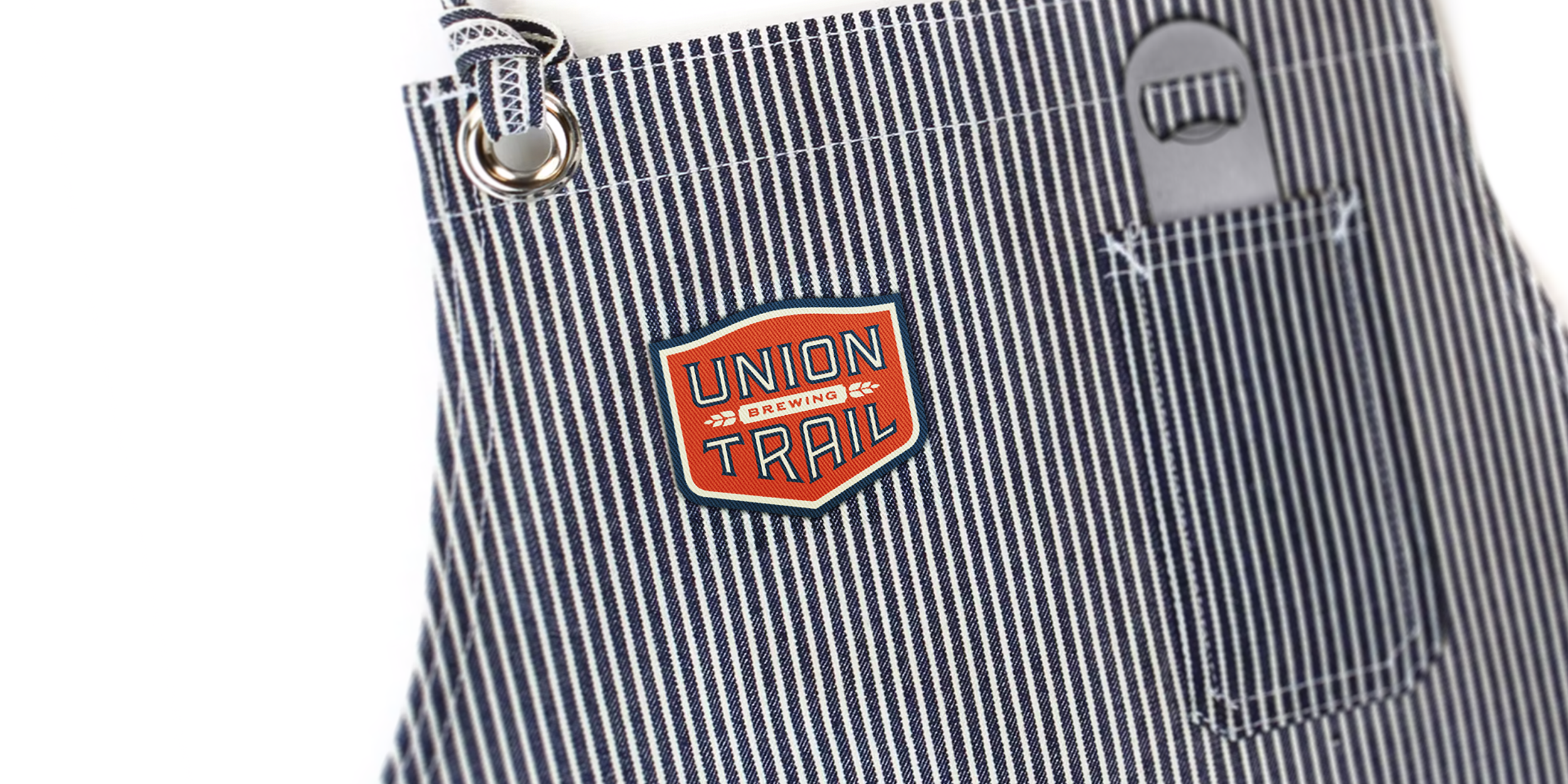
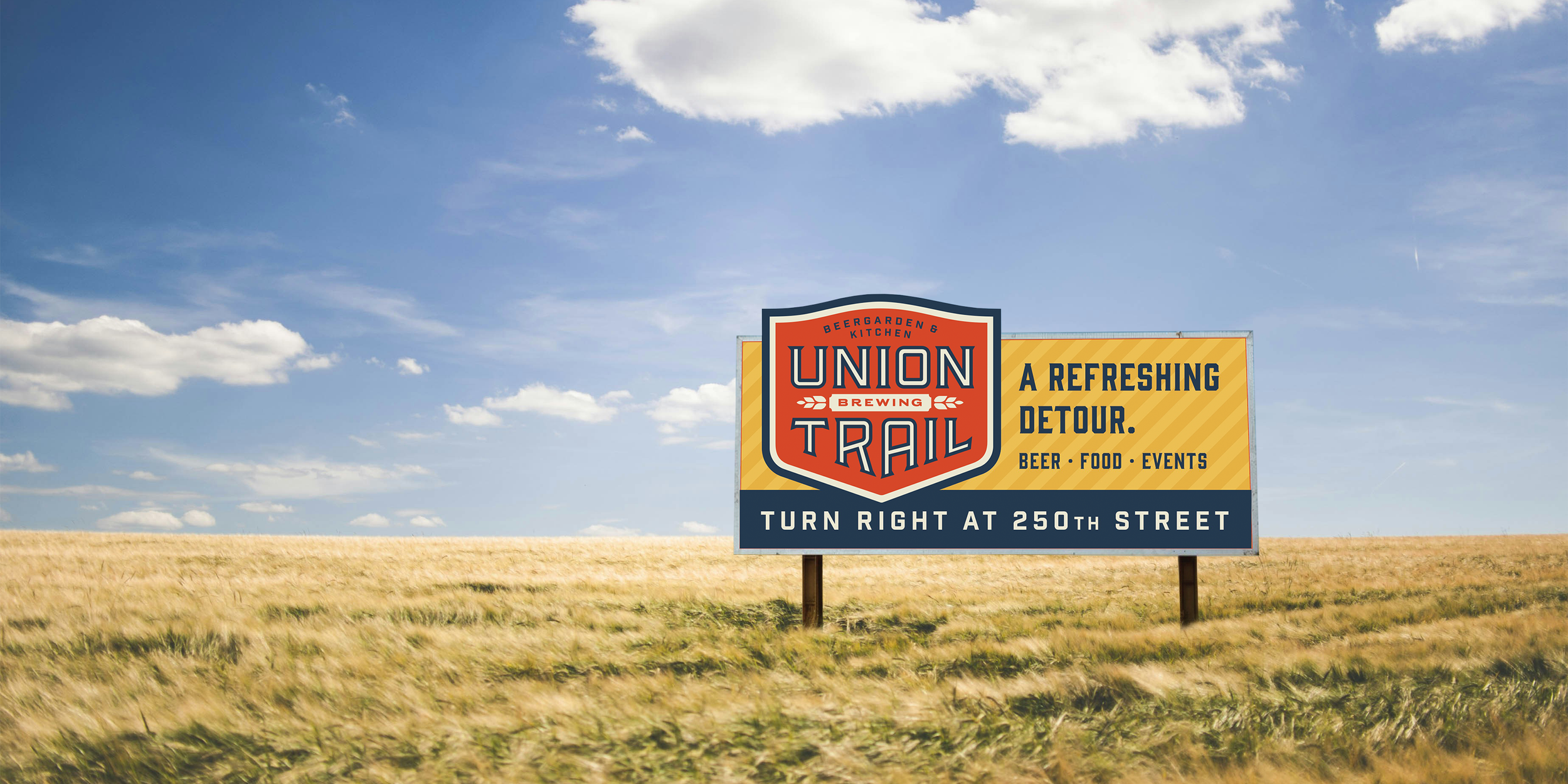
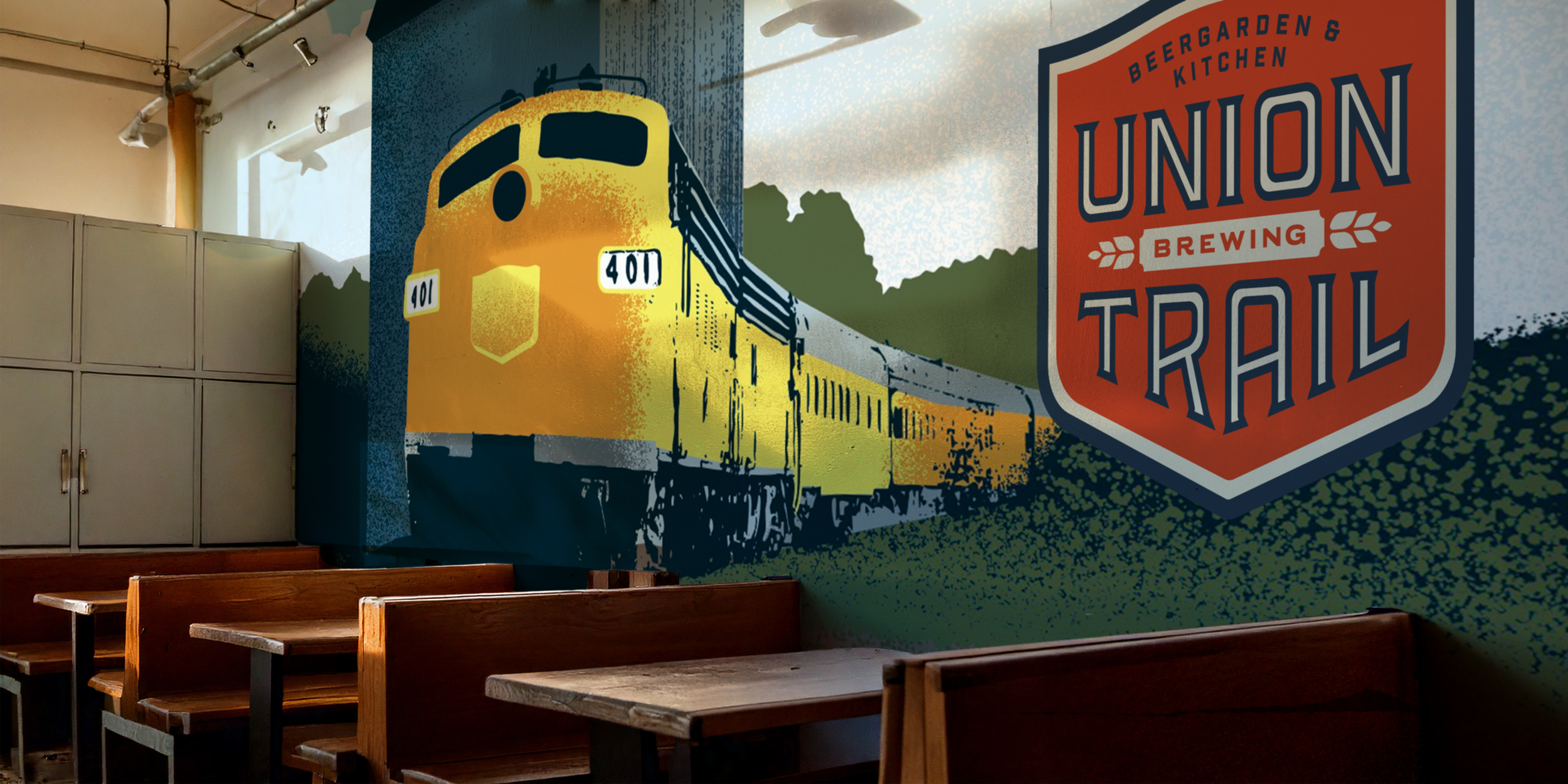
Union Trail Beergarden
& Kitchen
Liina Lundin, Creative Director
Craft brewery located along the old Union Pacific rail line in Blakely, MN. The client wanted something that nodded to the historic railroad with a classic Americana feel. The background illustration was created for a mural inside the brewery.

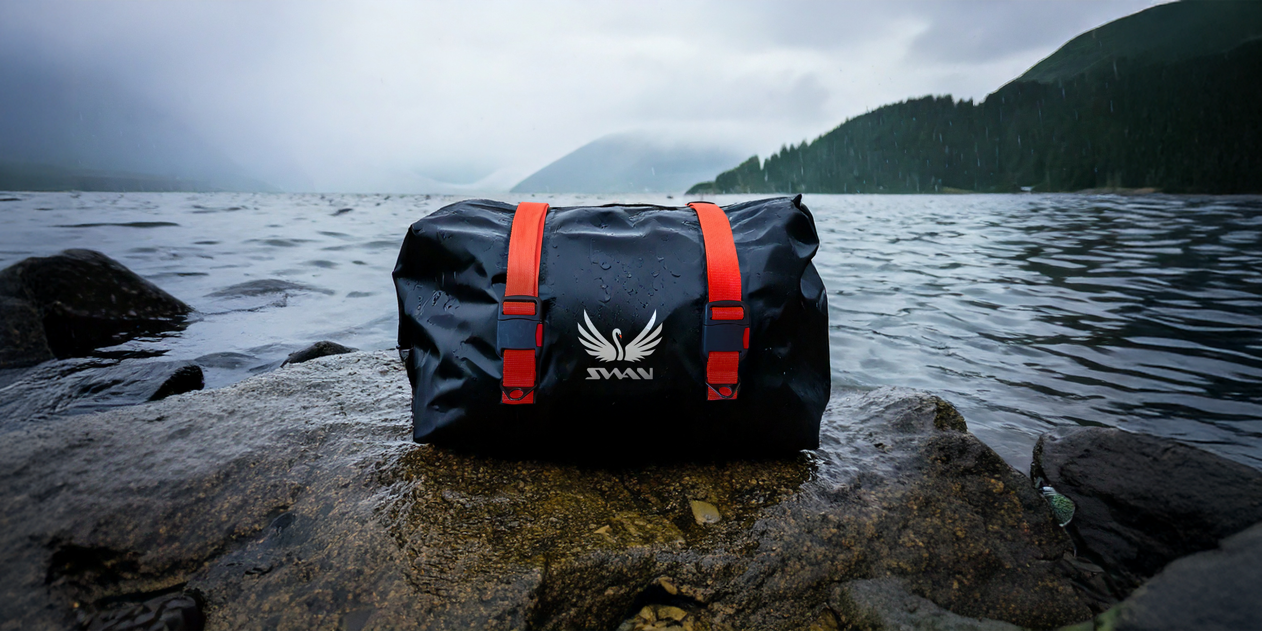
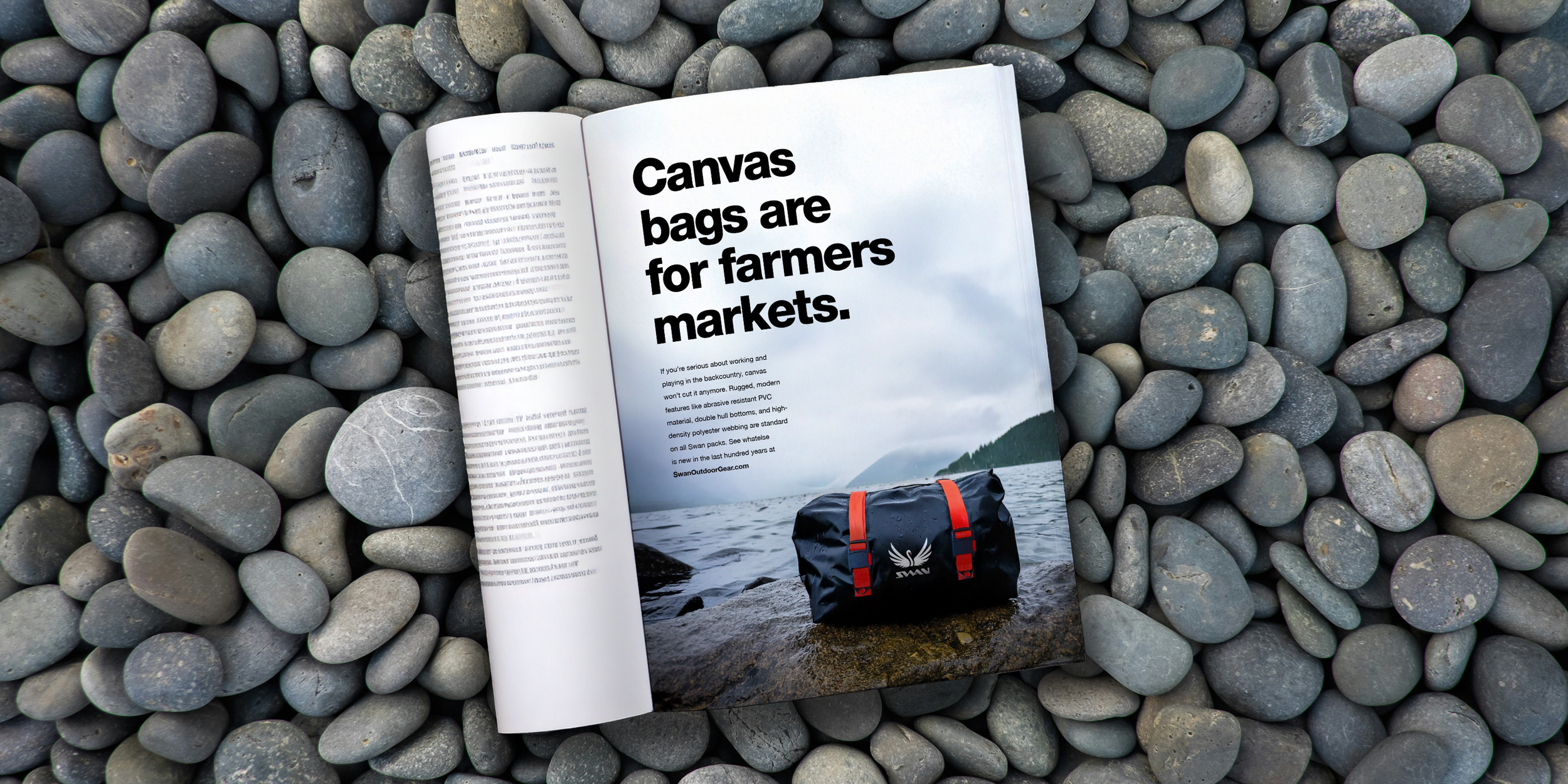
Swan Outdoor Gear
Swan packs are an alternative to ‘heritage’ canvas and leather brands. Swan backcountry packs utilize modern, heavy duty materials like PVC coated nylon, polyester webbing and solid metal hardware.


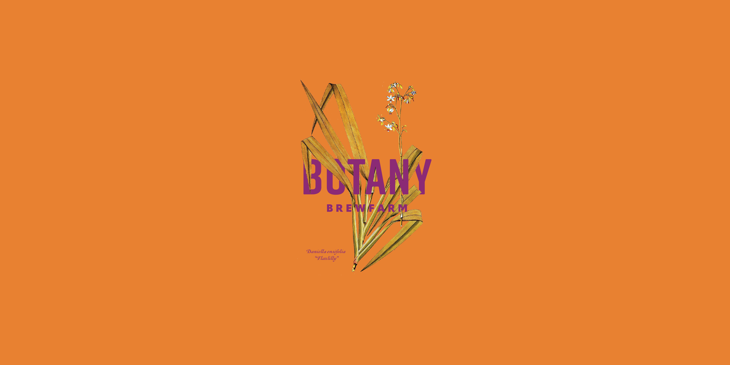
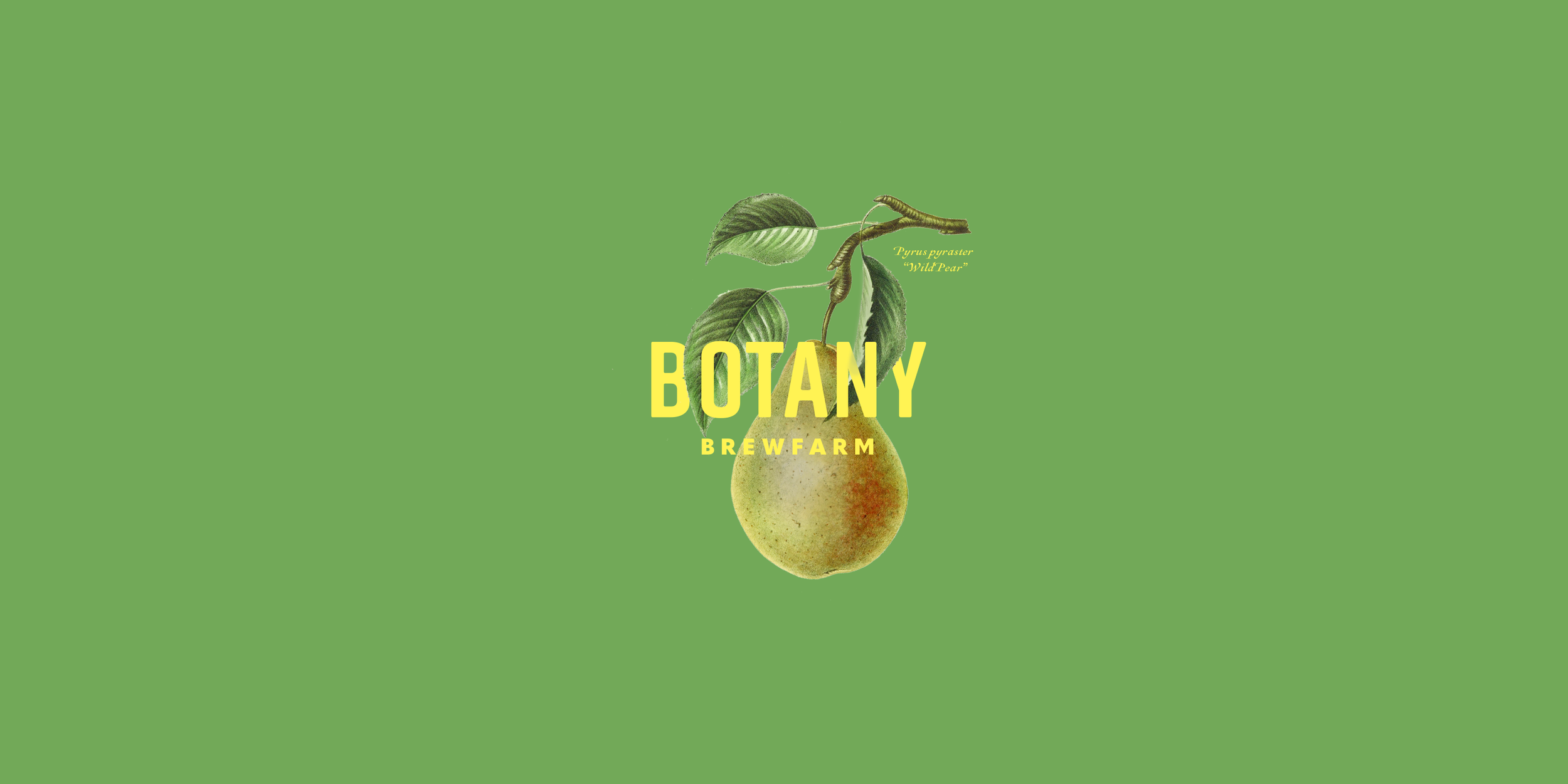
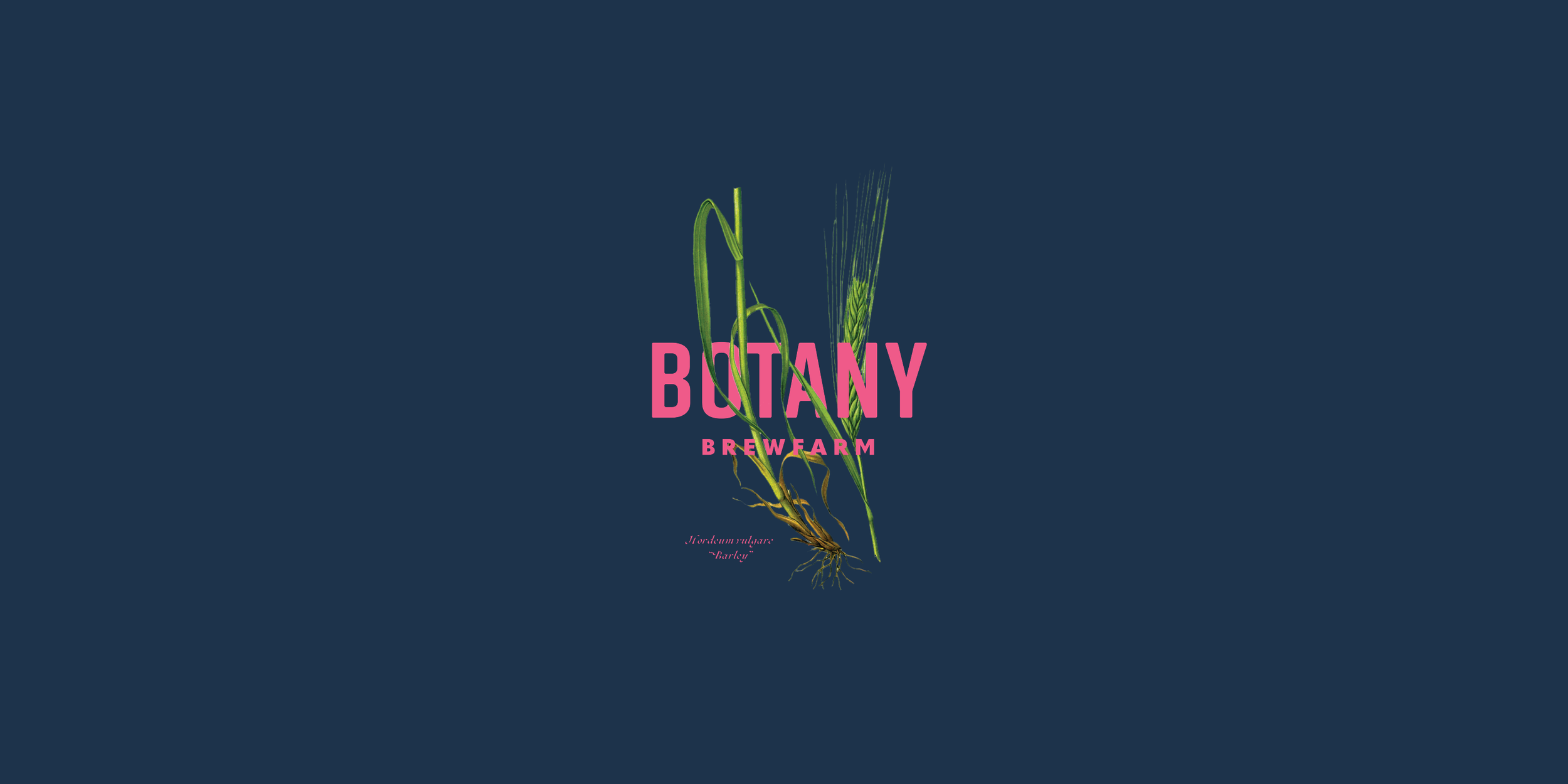
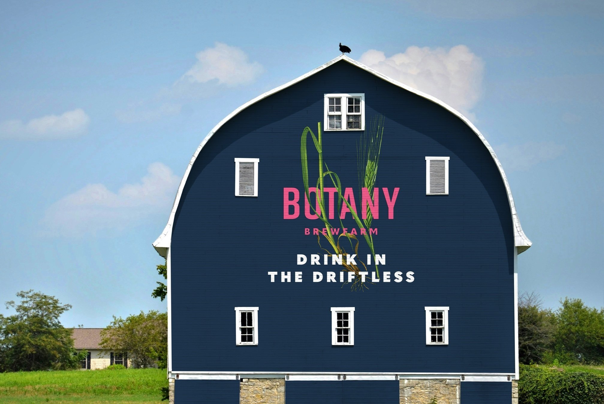
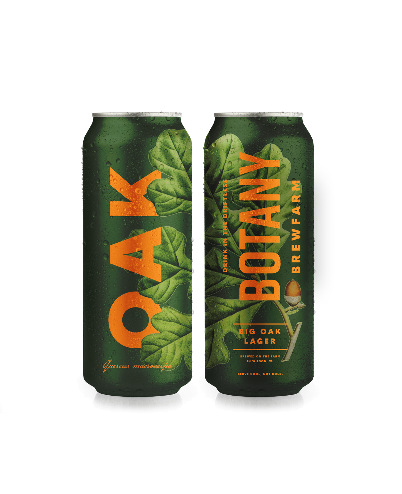
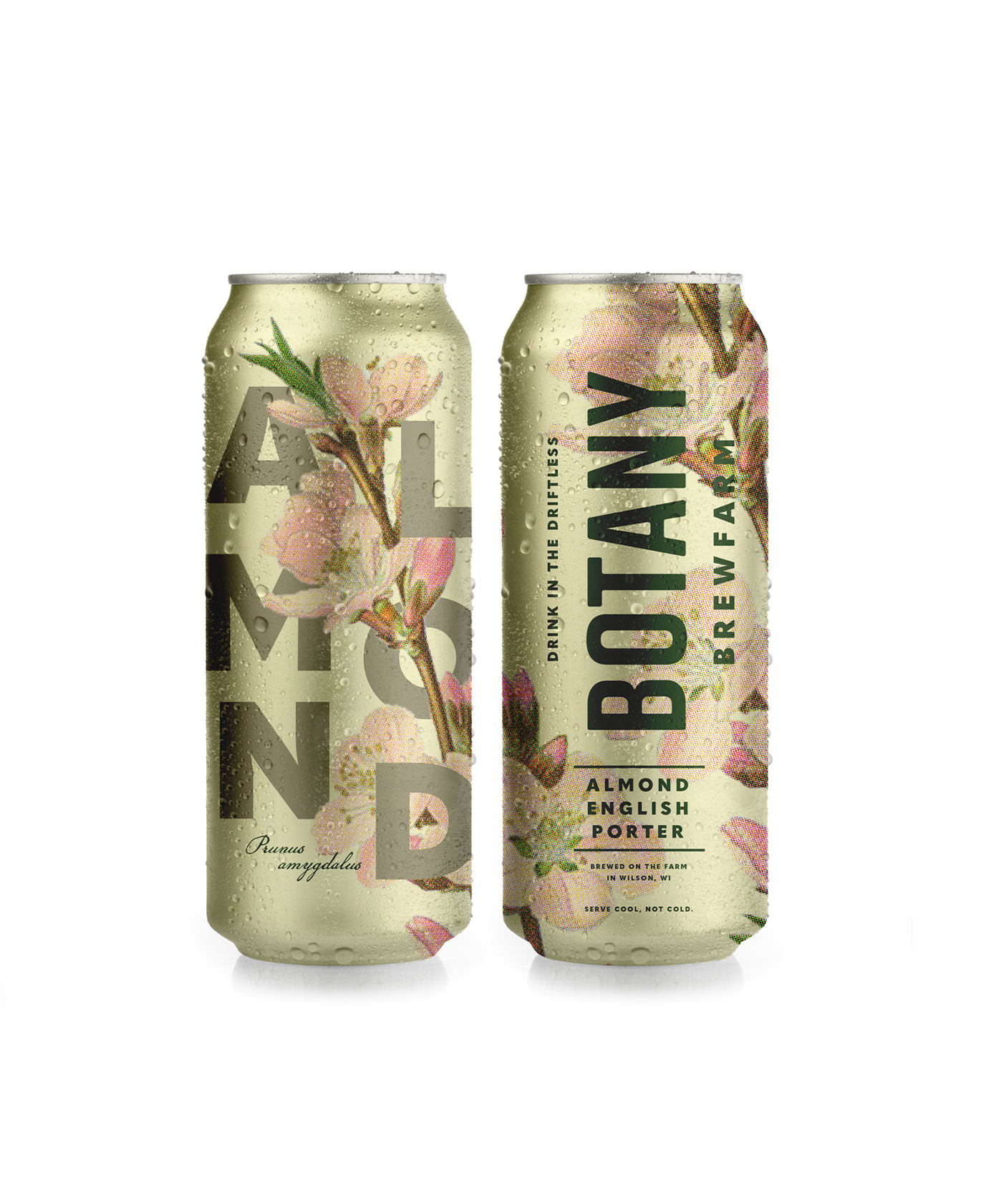
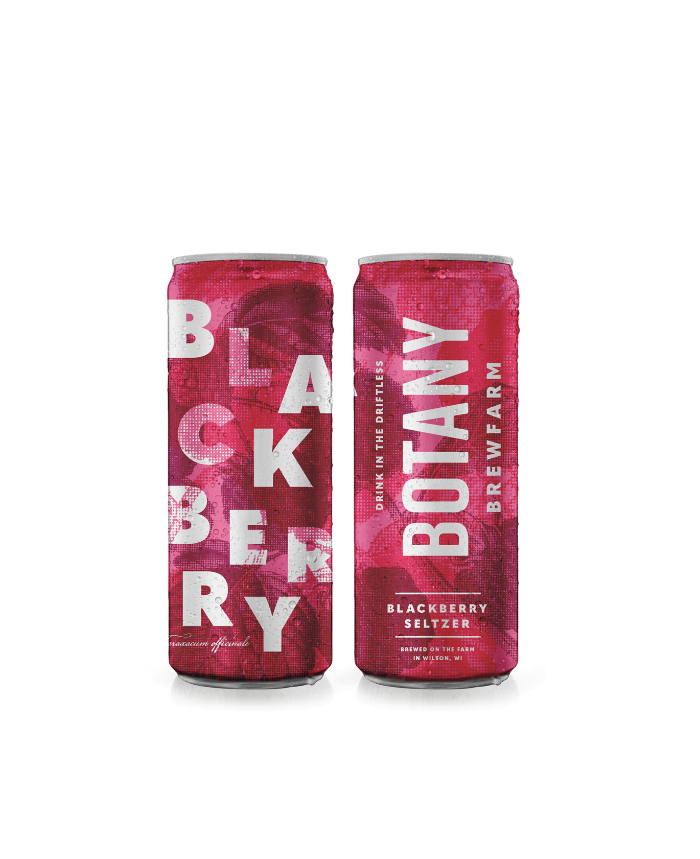
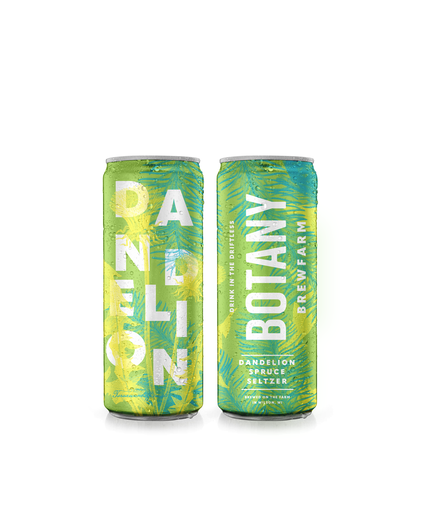
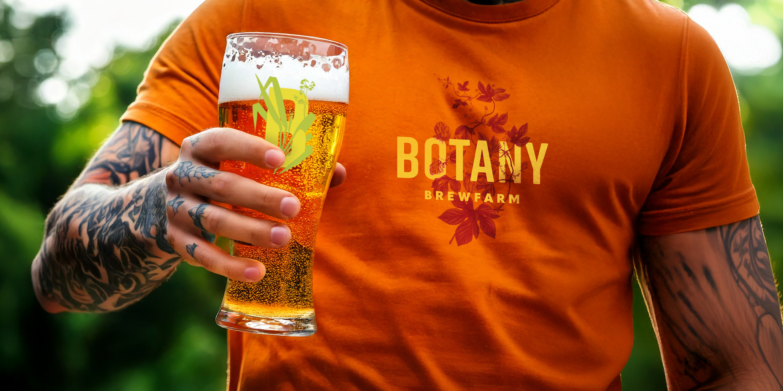
Botany Brewfarm
Botany Brewfarm puts a focus on using native grains and plants to produce unique beers that reflect the Driftless region where the brewery is located. The logo exploration integrates it with botanical illustrations of the local flora. The illustration usage ranges from the antique to the contemporary, reflecting the sensibilities of company.
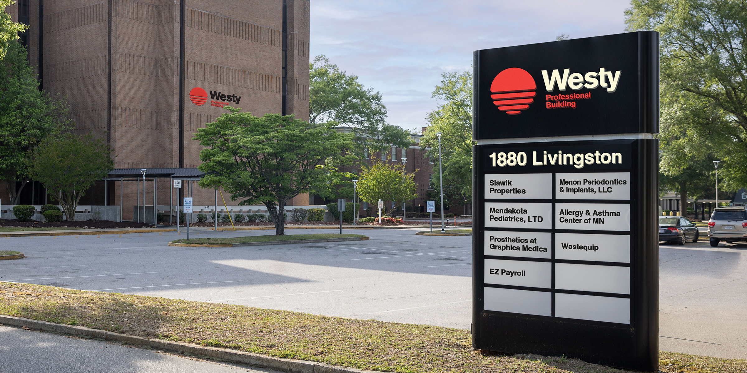
The Westy
First & First, Client
The Westy is a professional building in West St. Paul. The name inspired a logo of the setting sun, and the modern, brutalist architecture lent itself to a modern, almost Swiss style of typography.


Various logos
Other fun logos I’m proud of.
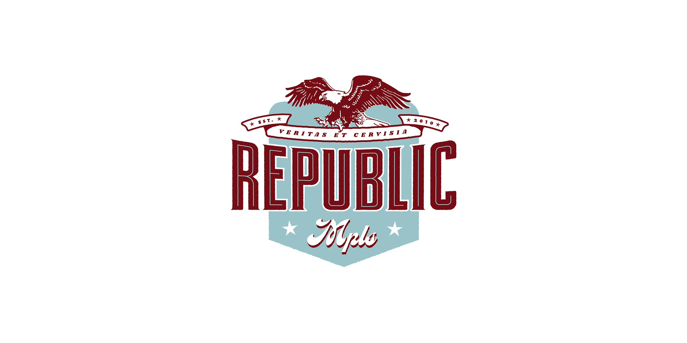
Custom lettered redesign of the Republic logo. The staff hated the eagle, so it was dropped. Republic closed due to the pandemic shortly after.
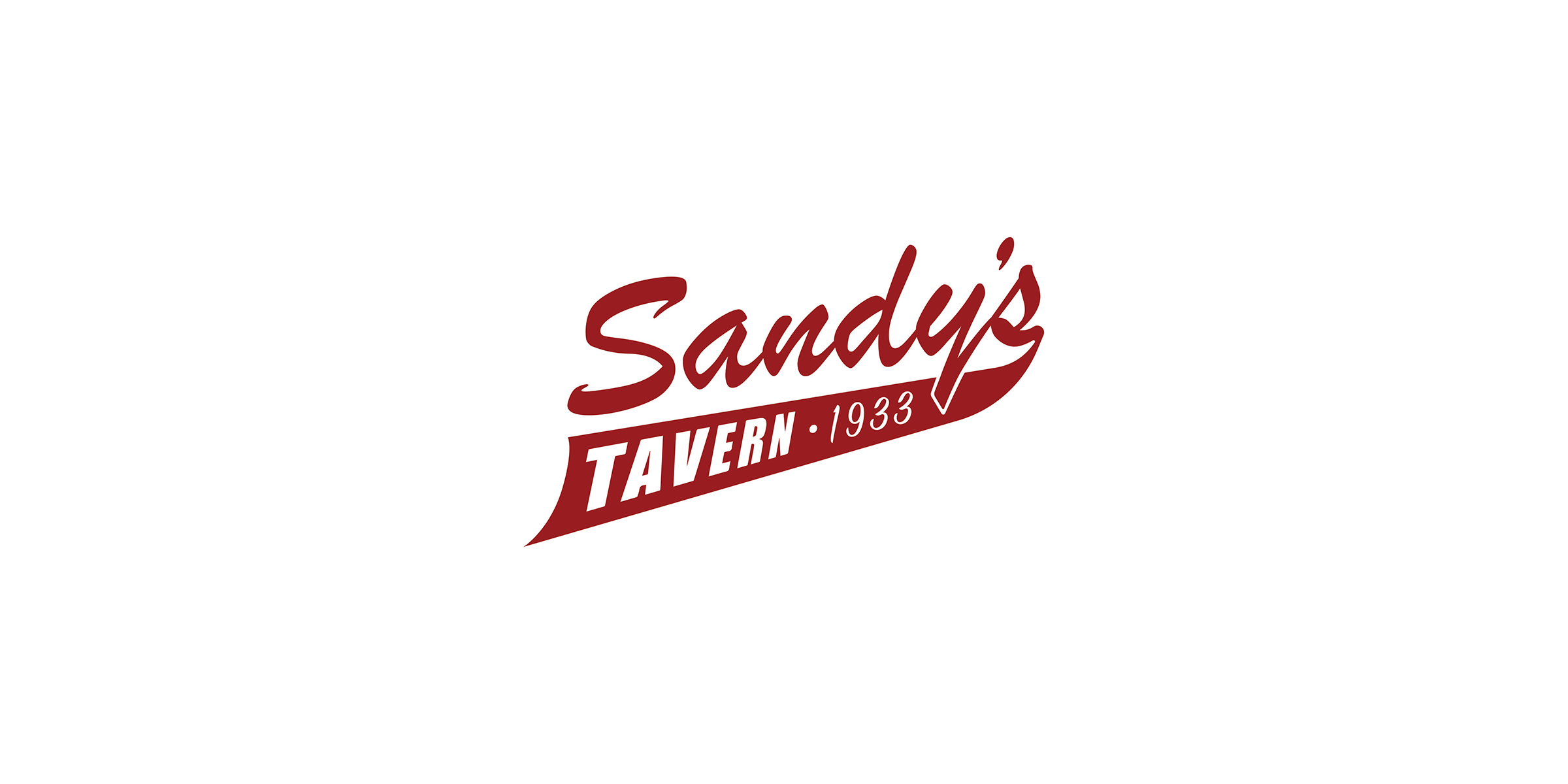
The redesign brief was "Imagine the logo on a softball jersey." I'm proud to have designed a logo with both Brush Script and Impact. "1933" uses a House Ind. typeface, but no one's ever noticed.
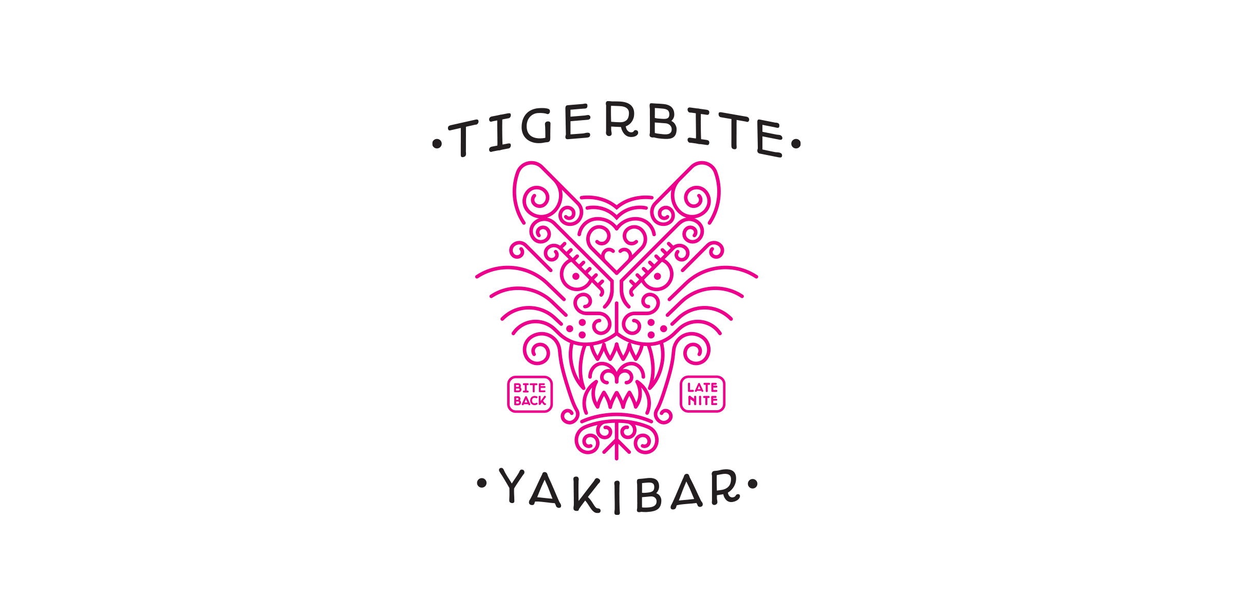
This was meant to be Yia Vang's late night concept run out of Lowry Hill Meats. It never materialized.
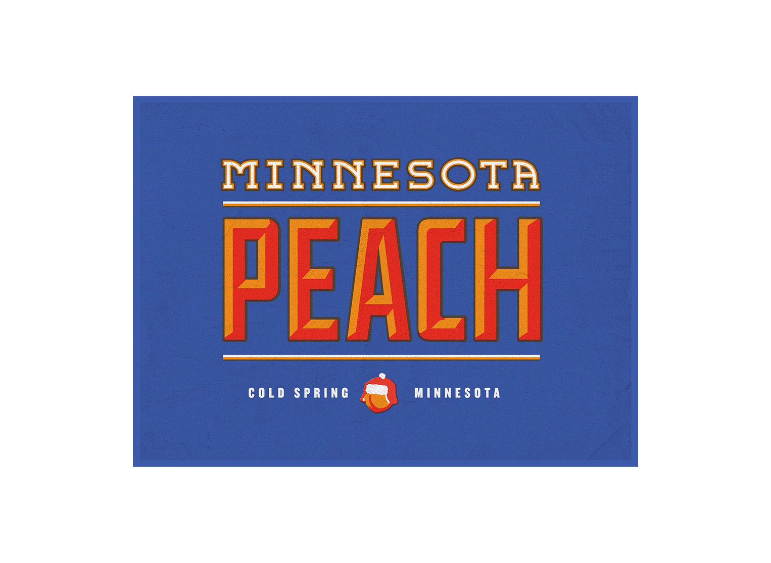
I made this logo for Dave, who was a farmer specializing in hearty fruits which would survive the Minnesota winters. I even added trapping to the colors to mimic vintage fruit box labels.